Solitude
/1
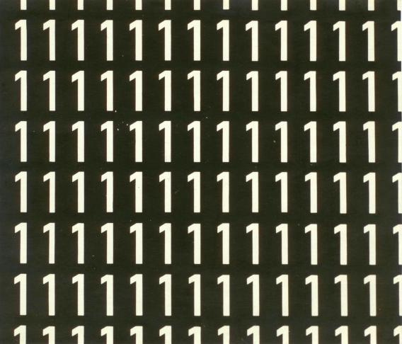
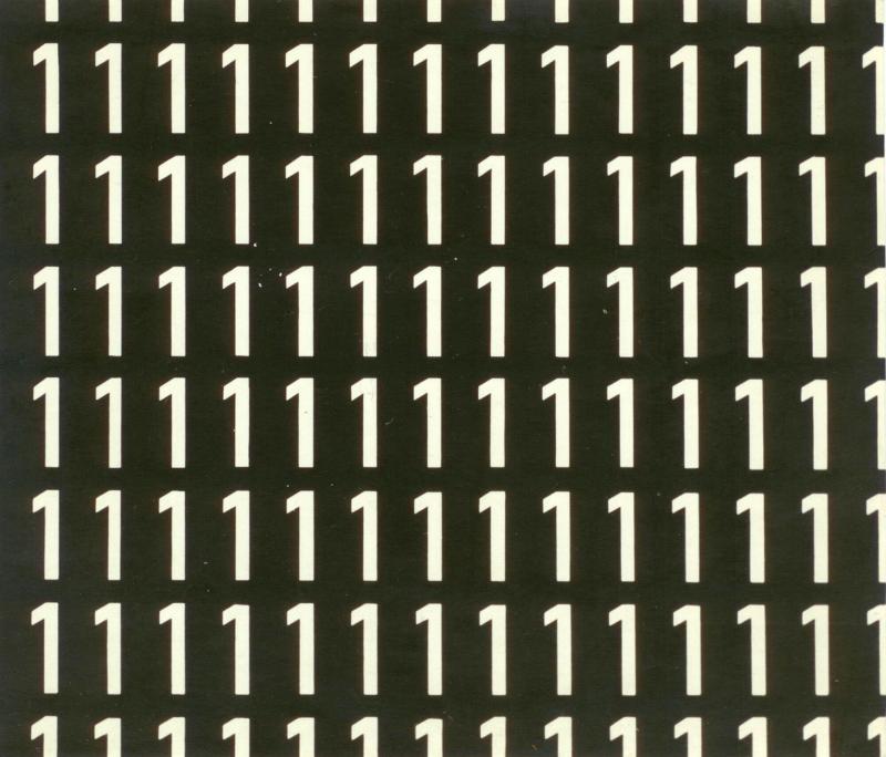
- Solitude
- Samotność
- 1967/2016
- b&w photograph
- 17,8 x 20,8 cm
In this version of "Samotność," larger and thicker white “1” numerals appear on a black background. The numbers placed on the margins of the composition are cut off vertically and/or horizontally in a way that suggests the infinite or a fragment of a larger whole, as well as being suggestive of the process of or only partial access to the experience of solitude. Unlike in Dróżdż’s Samotność version on the white background (also from 1967), it breaks the static “monotony” of the “one-number” composition, cutting off the sequence of numbers in such a way that one might take it for a film frame, or an excerpt of the overall painting’s composition. As Dróżdż mentioned, Solitude was always made using one specific font and could not appear in any other font—a fact that was important for its visual effect. In the same way as the Samotność version on the white background, it is a good example of the existential and more abstract numerical tendencies in the artist’s oeuvre. This gave rise to larger projects (such as Numerical Texts / Teksty cyfrowe) during the 1970s, projects that involved more dynamic combinations of ten numbers “running to zero” (from 1 to 0). B.P.

